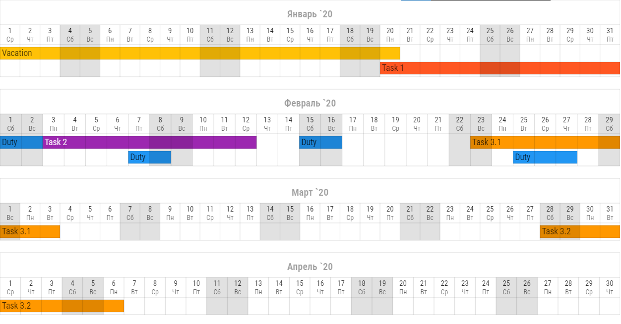
Svg renderer
svg_renderer section overrides period settings and specifies
styles for svg render.
You may override period settings specially for svg renderer. Use params from Render period section for it. For example:
svg:
  start: 2020-06-01
  finish: 2020-07-01
To determine svg styles you need to use styles sub section and css file.
In styles sub section it is possible to determine some properties,
that can’t be set in css.
There are properties like cell size, padding and text align.
Note
Using styles sub section drops all default style settings.
You can see default theme in linum/styles/svg/svg_default_context.yaml file.
Localization
It is possible to localize weekdays and months names. To do it you need to set your locale string:
svg:
   locale: ru_RU

Calendar width
By default Linum sets svg width as screen width, but you can set custom width:
svg:
   width: 640
Width value doesn’t affect to height.
css
Css (Cascading Style Sheets) - is a text file in which you describe the presentation of a structured document like svg or html.
Every element in the generated svg has class tags
which can be used as references in css.
For example cell with day date has tags
cell, header, day and background.
Referencing to this element will be:
.cell.header.day.background {
   fill: #FFFFFF;
}
You may check element class tags using special developer tools in your browser.
In Google Chrome you may press ctrl + shift + c to activate it.
Note
Using css drops all default css style settings.
You can see default theme in linum/styles/svg/svg_default_style.css file.
Default value for css key is DEFAULT_CSS.
After creating css file you can specify path to it for Linum:
svg:
   css: path/to/your/css.css
styles
There is 3 sub sections for styles section:
headerto determine header style;layersto determine layers style;gridto determine grid style.
style
For all sub sections in styles section it is possible to set up custom css style.
Use style keyword for it.
svg:
   styles:
      style: "font-family: Roboto Condensed;"
This style will have higher priority then styles from css file.
Linum styles
Linum styles is a set of style properties that can’t be set in css.
For example text element has absolute but not relative coordinates. Setting align for text in css will have no effect. In this case you need to use linum style settings.
Height
Use height key to set element height in px. Example:
svg:
   styles:
      height: 100
Padding
Example:
svg:
   styles:
      padding-left: 1
      padding-right: 2
      padding-top: 3
      padding-bottom: 4
padding-left sets left padding in px.
padding-right sets right padding in px.
padding-top sets top padding in px.
padding-bottom sets bottom padding in px.
Borders
It is possible to create individual borders for cells. Example:
svg:
   styles:
      left: True
      right: True
      top: True
      bottom: True
left creates left border for cell.
right creates right border for cell.
top creates top border for cell.
bottom creates bottom border for cell.
Align
To set align for text element you need to use both css and linum styles.
With css style you set anchor point and with Linum styles you set aligning for this point.
For example, if you need your text in top right corner you must write this in your context file:
svg:
   styles:
      align: right
      valign: top
and this in your css:
.text {
   dominant-baseline: hanging;
   text-anchor: end;
}
align key sets horizontal align.
Value must be one of: left, center or right.
valign key sets vertical align.
Value must be one of: top, vcenter or bottom.
Cells styles
Linum’s calendar header consists of cells. Tasks are cells too. There are two keys for each cell:
backgroundto determine background style;textto determine text style.
use Linum styles to determine background and text sub sections.
svg:
   styles:
      header:
         days:
            text:
               valign: vcenter
               align: center

            background:
               style: "opacity: 0.87;"
Header
In header section you may determine header style.
All of Linum styles may be used in header section
and in it’s sub sections.
There are three sub sections in header section:
monthsto determine months row style;daysto determine days row style;weekdaysto determine weekdays row style.
svg:
   styles:
      header:
         align: center

         months:
            valign: bottom

         days:
            valign: vcenter

         weekdays:
            valign: top
Months, days and weekdays are cells. So you may use for them Cells styles.
Layers
There is layers sub section to determine styles settings of calendar layers.
To set indent between calendar layers use indent key:
svg:
   styles:
      layers:
         indent: 20
Tasks
tasks is a sub section of layers.
In tasks you may use all Cells styles and two other keys:
indentto set vertical indent between tasks;auto-font-colorto set auto font color.
svg:
   styles:
      layers:
         tasks:
            height: 20
            indent: 4
            auto-font-color: True

            text:
               align: left
Grid
There is only one key for grid subsection. It is style.
See style for information how it works.
svg:
   styles:
      grid:
         styles: "stroke-opacity: 0.12;"